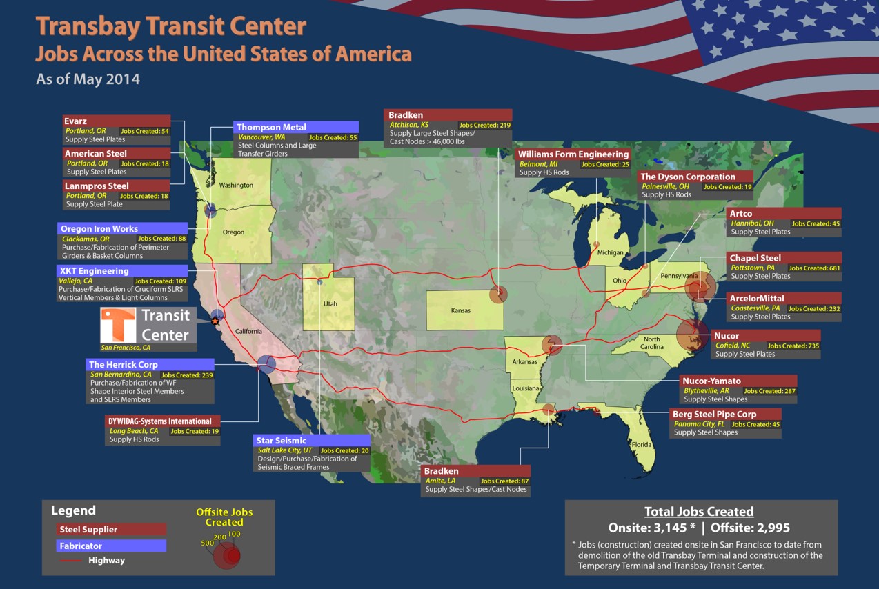
Map of U.S. Jobs Created by the San Francisco Transit Center Project
The Jobs Across the United States of America Map was started in 2014 to show the Transit Center Project job creation impacts across the United States of America. This would be used to secure funding to complete the project. The San Francisco Transbay Transit Center Project is a Buy America project which means nearly all the materials used in its construction are American made. The leadership knew thousands of jobs were being created across the country and they asked me to come up with a way to illustrate it.
I developed the first version of the map just as the steel for the superstructure began arriving. Tracking the steel supply chains was easy. At the time steel mills in Arkansas, Louisiana, Michigan, Washington, Ohio, Pennsylvania , Kansas and a handful of other states were supplying the vast majority of the steel. I asked the construction manager to talk to the suppliers to estimate the number of jobs created in each state. I then compiled the information into a spreadsheet and created a simple map highlighting those states. Since the data was limited, it was easy to manually update the map.
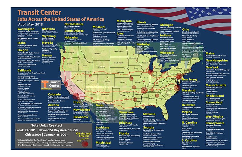
As the project progressed, the diversity of suppliers increased dramatically. Tens of thousands of products and services were being provided by over 900 American companies in nearly every state. The volume of information overwhelmed what was possible to track in Excel. So I began building a database to handle all the mountains of data flowing in from 40+ diverse trade packages such as plumbing, electrical, interior finishing, HVAC, civil, fire protection, etc.
Contractors submitted information on every item, including Buy American certificates to the project engineers for review prior to installation. Soon the volume and complexity of the data outgrew what could be tracked using spreadsheets alone. I entered details of each item into the database including the company that made it, the location of the manufacturing facilities and their supply chains. I would walk the construction site to verify the materials being used, researched the companies online and talked to suppliers to ensure the best possible information was being used. Each summer, interns would could help me enter the information and research suppliers.
The Jobs Database was unique in that it allowed for the organization and cross referencing data from many different sources such as product data submittals, engineering drawings and calculations, mill reports, testing reports, contractor schedule of values, site surveys, internet research, interviews and phone calls with project managers on site and suppliers across the nation. The database gave us the ability to link this data to create estimates of total jobs created with specific products, manufacturing facilities, cities and states which could then be projected on a map.
Data Collection
Product and Services Information
I started developing the database by tracking all 44 trade packages and the current billing status of each from month to month. Then, with the help of interns and our document control, we began the mining the thousands of contractor submittals, pulling information who was providing what and where they were located.
Cost Information
As a rule, the Prime contractors of each Trade Package do not readily provide detailed breakouts of how much they are paying their suppliers and services providers, so it was necessary to develop our own way to estimate values of products and services to the company information collected in the submittals.
At the end of each month all the Trade Packages submit a Schedule of Values (SoV) showing how much work was completed and the work's value. An SoV may contain a few as 30 line items to 500 line items. Sometimes we were lucky and a line item could be matched directly to a product but most of the time labor, equipment and materials would be grouped under broad categories and would require some sleuthing to determine reasonable distributions of costs.
Data Processing
We matched each SoV line item with companies providing the goods and services related to that line item. A percentage contribution was determined per company per line item then the database would calculate the expenditures per company based on the total value of the line item multiplied by the percent contribution of that company.
This sounds simple enough until one considers there are thousands of SoV line items spread-out among the 40+ trade packages on the project. Those line items must then be matched against over 900 companies identified in the submittals.
Data Projection
Once the data is in the database SQL queries are run against the data to calculate the money and by extension, jobs, are being distributed among cities across the nation. That city/job data is then projected on a map of the United States.
As work progressed, we were able to document over 900 American companies spread across 500 cities in 48 states. No longer was it possible to update the map by hand so I developed algorithms to sort and project the data on the map.
The maps were circulated widely at public meetings and among members of state and federal government.